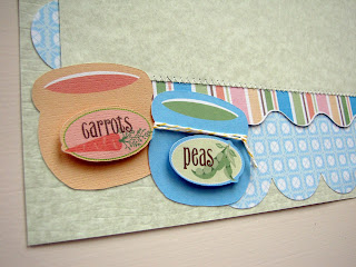
Here is a layout to capture baby's first solids:
I created this LO using the Imagine cartridge Nursery Tails and Cricut cartridge Sesame Street Font. For added texture and interest, I sewed s zigzag stich on the borders of the picture frames and stickled the bib.


This is too Sweet!Precious!Love all the details on this layout!The bib,and Fork & Spoon let me in speechless.........I am hoping to one day own an Imagine.TFS....Fabulous Work!
ReplyDeleteThis so precious!
ReplyDeleteAdorable layout!! Lee-Ann :)
ReplyDeleteGreat layout with wonderful details and plenty of room to put photos. TFS
ReplyDeleteI love your layout. So cute.
ReplyDeleteKerry
mommakcrafts.blogspot.com
Great layout Renee, the images, esp the fork & spoon are so cute!
ReplyDeleteThis is so adorable! Good luck in the challenge!
ReplyDeleteColleen
Like your blog! As a project with middle school students, I had them make paper. They loved it. Have you thought about incorporating homemade paper into your designs? ;)
ReplyDeleteWhat a fun layout! Renee, you are amazing! How do you think of all these wonderful ideas and projects! Such a creative spirit!
ReplyDeleteThank you for commenting on my thread over on the Cricut Circle Message board about lossing followers!
Carolyn
http://cccscraproom.blogspot.com
cccscraproom@windstream.net
This is so cute! I just ordered Nursery Tails and you've given me more ideas for its use!! Thank you!
ReplyDelete